72 Hour Design Challenge
March 16, 2016
I was challenged to redesign a digital product of my choice, for any platform, within a 72 hour period, spending only “a few hours”. Well, I accept the challenge and will be posting my progress here over the next 72 hours. Expect to see ideation, iteration, problems, solutions, users, images, and maybe even a chart or diagram if we are lucky.
Day One
Well, it has been a couple of hours since I wrote the paragraph above and I did the following:
- cleaned off the dinner table
- helped put my son to bed
- cleaned the dishes
- played guitar
- worked on a birdhouse for charity
- opened the laptop to begin research for this “project”
Some may say “Johnny, you’ve spent several hours after starting this project, which has a quick turnaround time, with your family and on some recreational activities, and you could have been researching online.”
True. I could have jumped right in and started surfing, searching, and browsing, but I needed time to think, and take care of my family, and think, and take care of myself, and think some more.
First, I thought about the parameters with which I had to work:
-digital product: I took to mean website, app, software
-any platform: laptop, desktop, phone, tablet, phablet, xbox
-72 hours: I made that up because it sounds and looks cool. The challengers actually used the words “3-4 days”. So, taking the time spent thinking about the challenge into account after I actually read the challenge email, I have approximately 72 hours.
-a few hours: Actual words used in request. A bit vague but I’ll take that to mean 2-4 hours.
Secondly, or thirdly, I thought about what specifically to redesign. Should it be in my wheelhouse where I’m comfortable, like an industry I’m familiar with or something I’ve given some thought to before? No, that seems like cheating a little.
Should it align with a hobby or passion? That might make it more interesting for me.
Should it be a really famous product that people love to hate, like and unlike, be-friend and un-friend, post and view timelines on? Nah, that would be boring.
Should it be a redesign for a non-profit or charity who might benefit from some pro-bono work? Sounds pretty noble.
At this point I’m probably rocking out to some electronica, hip-hop and drilling holes in my birdhouse project (here’s a sneak peak at this project and the cause) and getting inspired to write about and redesign something. But I really need to budget out my hours:
- Hour one – framing problem, solution conception
- Hour two – UI/UX research
- Hour three – workflow and wireframes
- Hour four – visual design and final presentation
Now, some may say “Johnny, there is no fucking way you are going to redesign a well known digital product in 4 hours over three days!”
Well, I say it wouldn’t be called the 72 hour design challenge if you had 6 months to redesign something, now would it? It would be called the 6 month design challenge, and where’s the fun in that?
To sum up Day One: thought a lot about what to redesign while doing other activities, prioritized and clarified requirements, created a time and task list, and snuck in a little research a head of schedule (see galleries below).
Day Two: The two contenders square off
Below are galleries for two sites I’ve been considering redesigning, Craigslist.org and Wikipedia.org. Both are very text heavy sites that could use some help with visual cues to help users explore more content, page hierarchy to help guide the user to useful content, and cringe-worthy backend tools.
Portland.craigslist.org screens shots looking at the purchasing workflows, account signup, event pages, discussion forums, and the search feature:
-
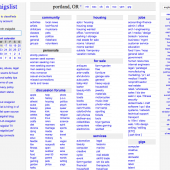
- Portland Craigslist gallery for 72 hour design challenge.


Wikipedia screen shots looking at entry pages and editing features:
-
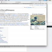
- Wikipedia gallery for 72 hour design challenge.


After reviewing the two sites, I’ve decided to redesign Wikipedia. Craigslist’s sea of text and disjointed spacing seems oddly appropriate for the services it provides. Wikipedia poses more interesting design and development challenges. Including:

Oceans of text and not much land to anchor your eyes on.

A site that can be edited by anyone in the world using complex markup language! And Bots!

Holy crap! This site uses Bots to monitor changes for ClueNet? (Of course, there is no entry for ClueNet. As if it didn’t exist. Hmm.)

ClueBot NG’s user page.
Now some housecleaning:
Hour one – framing problem, solution conceptionHour two – UI/UX research -Ai??(Note on users- without adequate research, I’m making assumptions about Wikipedia users: they are humans who speak many languages and Bots!)- Hour three – workflow and wireframes
- Hour four – visual design and final presentation
Looks like Day Three is going to have to carry the brunt of the work with two hours of ideation, workflows, and design. If I’m lucky, I’ll spend one hour and 45 minutes thinking of the solution, and use the last 15 minutes for visual design, building up the creative pressure to the breaking point. Not something you want to do too often, but deadlines can be great for creativity.
Day Three: Cards, Funnels, and Hover-experience
Full disclosure: Although I was able to do my concepting, wireframing, and design within the alloted 72 hours, I’ve haven’t had a chance to add my ideas to this blog post until today. Which puts me over by about about day.Ai??
Having the accumulated knowledge of mankind at your fingertips is Wikipedia’sAi??lofty goal. My goal is to make Wikipedia easy to access, organize, and edit.
Idea 1. Card & Containers
Cards and containers is a design patternAi??being usedAi??by many major websites. Cards provide context and an entry point to more robust information and views. Cards within a Container can each contain a unique data set and specific calls to action. This design pattern is especially useful for screen sizes smaller than laptops.
Some examples include Pinterest andAi??LinkedIn:


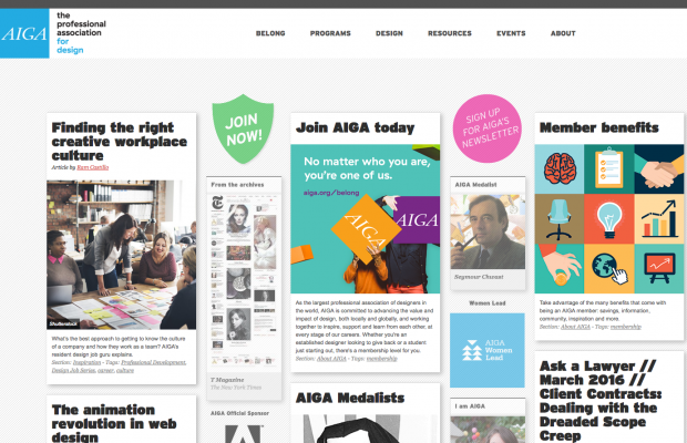
One of my favorite sites that uses Cards is AIGA.org, which is great for browsing:


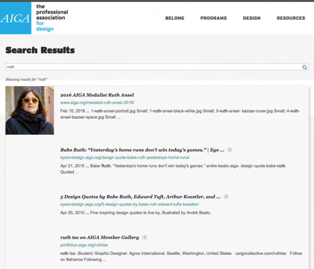
However, the search feature is lackluster:
I like the search feature used by Jive, which searches as you type and displays the results in sub-catagories:
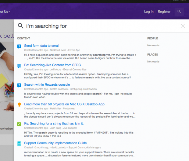
In addition to People and Places, you could have Images, Audio, Video, Books, etc. This same categorization could be applied to Wikipedia’s search feature, nav bar, editing pane, Ai??and References section. Which leads us to Funnels.
Idea 2. Funnels

We can use Funnels in searching, browsing, and editing to guide the user to her desired result.
Searching:
The user narrows down results as they type, narrowing the funnel until desired result is found.

Browsing:
Using levels of categories and visual clues, a user can narrow down their desired subject.
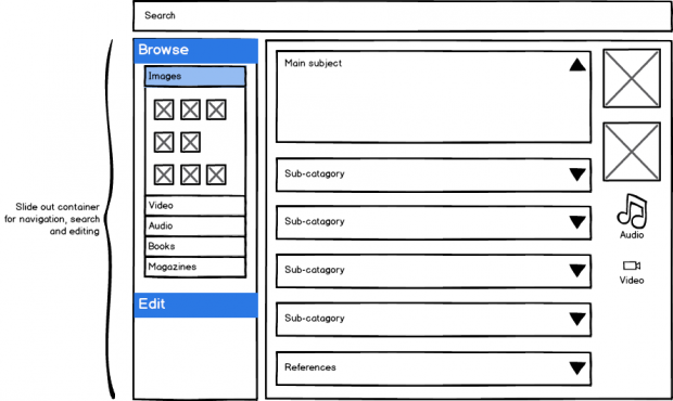
Editing:
Combining a browsable library with iconography, a user can drag-and-drop items into an Editor Funnel, which helps put the item in the appropriate category.

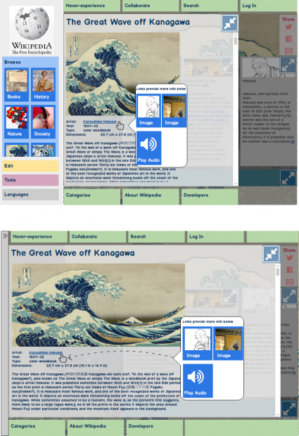
Idea 3. Hover-experience
In order to help the user fine-tune their experience, I’ve added a control at the top of the screen to select the type of information display on hovering (or tapping). Ai??The mechanics of how associated images, video, or audio are displayed when hovering over a link is sure to be complex, whether it appears above or to one side. But the holistic experience of seeing images and hearing music while learning about a subject is intriguing.

Final Presentation:
Main entry screen:
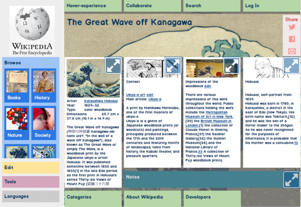
Article expanded:

Side-bar collapsed and article expanded:

Hover-experience enabled with sidebar and without:
In summary
In roughly 72 hours, I’ve redesigned Wikipedia to incorporate color and Cards for more visual appeal; defined the data architecture to showAi??general to detailed information moving left to right and top to bottom; explored persistent mouse-hover and floating panels to enrich the visual and auditory experience of the user; redesigned the editing experience toAi??allow for drag-and-drop onto cards and to have the back-end do the heavy lifting of dynamically cross-referencing links, notes, and reference sections.
You might also like:
Tags: card model, hover-experience, redesign, ui, ux, wikipedia